Problem

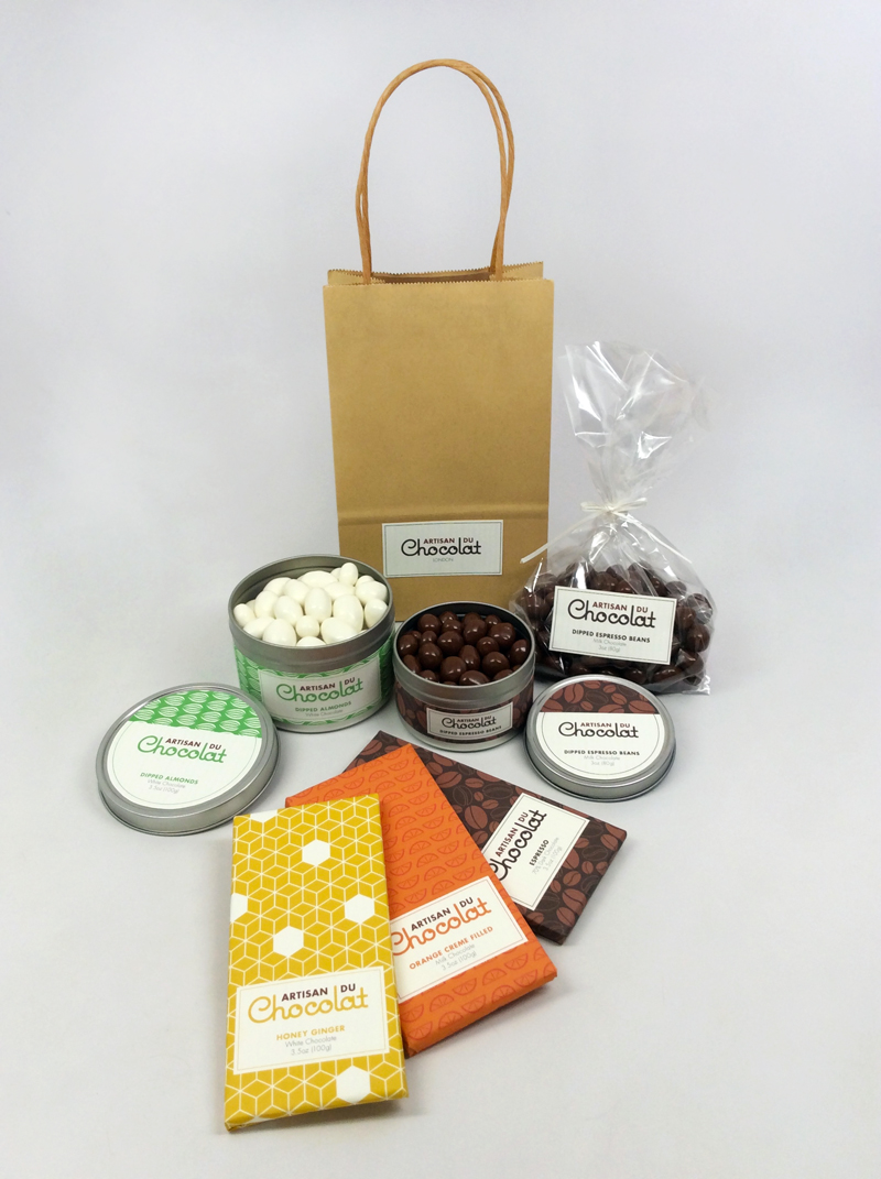
Artisan du Chocolat is a fine chocolate shop in London owned and operated by Belgian and French-trained chocolatier Gerard Coleman. Their current identity has a variety of issues. Its extended lowercase “a” is awkward. A combination of typefaces in condensed, regular, extended, uppercase, and lowercase creates a clumsy mark. While their identity strives for elegance, it reads as sterile and graceless.

Furthermore, the current package designs for Artisan du Chocolat use brown and white only, which becomes boring and repetitive. Color is used on some of their chocolate bars, but doesn’t necessarily distinguish one flavor from another.

Solution

This rebranding was designed to reflect the personality Artisan du Chocolat shows in their unique creations and flavors. The new identity juxtaposes the relationship between Coleman’s modern creations and the traditional artistry of a chocolatier. The word “Chocolat” is accentuated to evoke a sense of smooth chocolate, contemporary elegance, and a touch french provincial design. A playful, round typeface was modified to connect letterforms and create the flowing effect.

Patterns also play a major role in this rebranding. They add a much needed contemporary, colorful flare to the brand. Each flavor profile would have its own pattern, so it could be easily identified in any form of packaging.