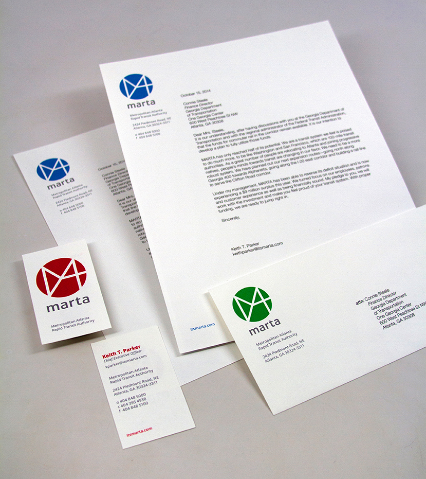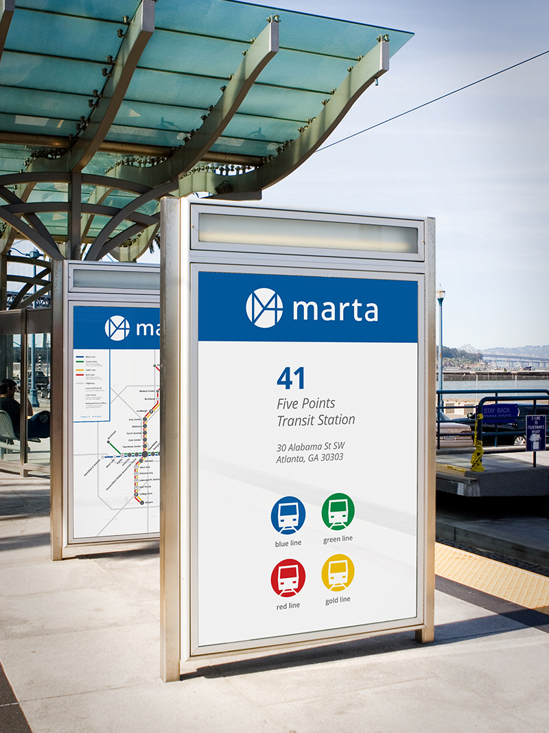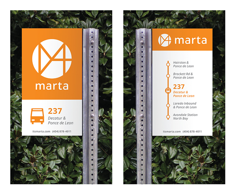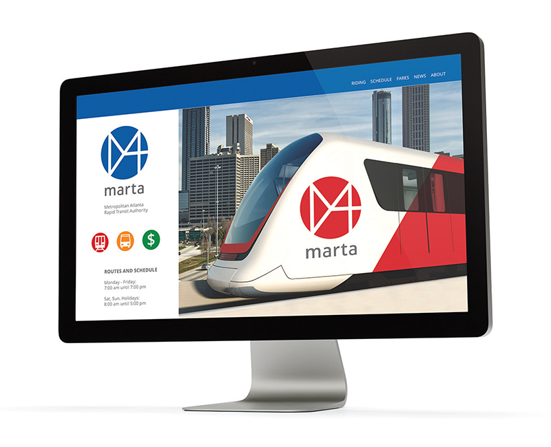

Problem
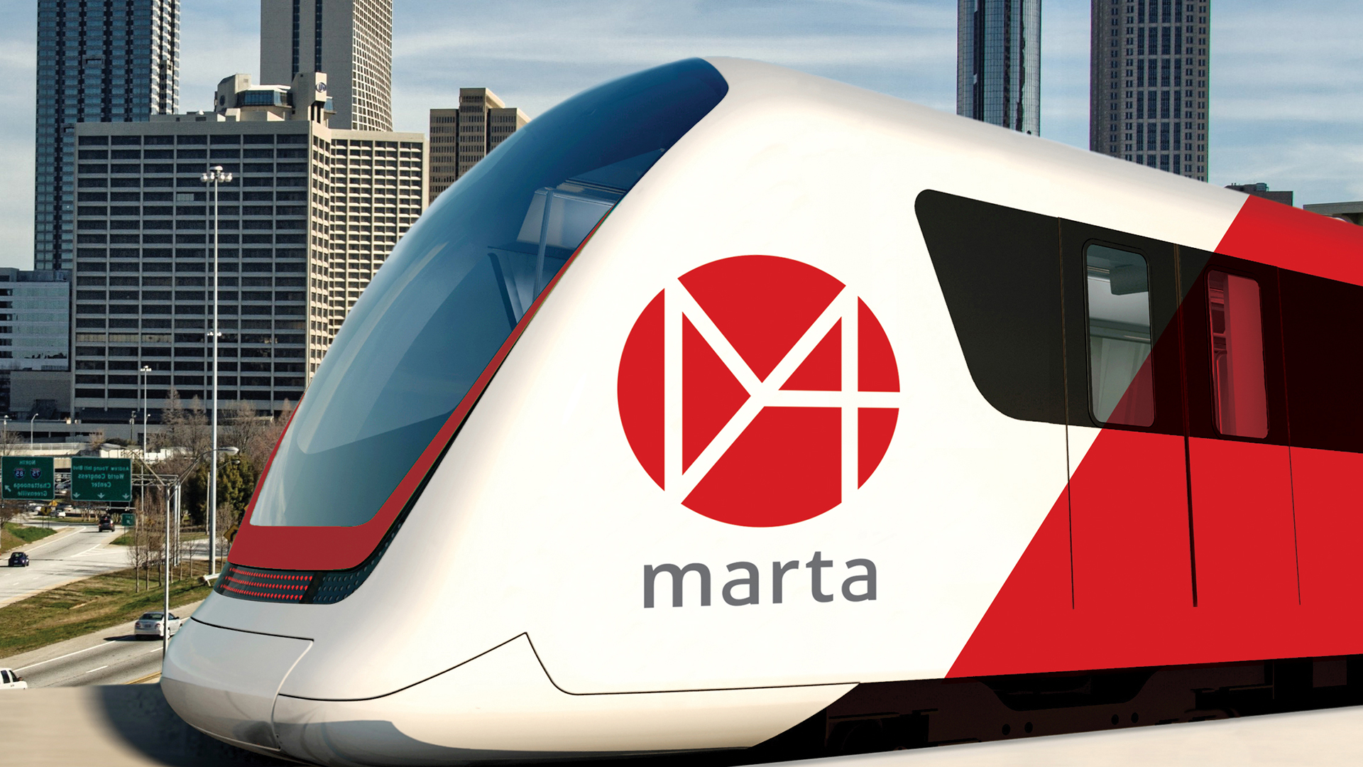
The Metropolitan Atlanta Rapid Transit System (MARTA) has been operating since the 1970’s with the same logotype. The typography is reminiscent of that era with the combination of rounded and square corners. As far as color, the black is dense and the colors feel dated. The icons are also chunky and overly detailed. With plans to expand and a desperate need for revitalization, this identity is holding MARTA back.